How to Write AI Image Prompts for Product Photos is a practical guide to turning an ordinary product idea into an image brief that an AI image generator can understand. Instead of typing “make a beautiful product photo,” you will specify the object, composition, lighting, materials, background, and details that must remain accurate. The goal is not to find magic words. It is to reduce ambiguity, review the output critically, and refine one variable at a time.
This guide works as an editorial workflow for someone preparing ecommerce mockups, social posts, or concept visuals in tools such as ChatGPT Images or Gemini. Features, account access, export options, and commercial terms can differ by service and change over time. An AI-created concept is not the same as a verified photograph of the real item: never use an invented shape, label, color, or accessory to misrepresent what customers will receive.
How to Write AI Image Prompts for Product Photos: a reusable formula
Build each brief from seven parts. The order is less important than making each part explicit. Think of it as a short creative brief rather than a string of artistic adjectives:
- Subject: the exact product, visible components, color, material, and any reference image you are entitled to use.
- Purpose: the intended placement, such as a catalog card, landing-page hero, email illustration, or mood-board concept.
- Composition: viewpoint, crop, amount of negative space, and where the object sits in the frame.
- Setting: surface, surroundings, background color, props, and whether people appear.
- Lighting: soft daylight, studio softboxes, backlighting, reflections, and desired shadow direction.
- Visual style: realistic studio product photography, editorial lifestyle photography, flat lay, or an explicitly illustrated look.
- Constraints: details not to change, text to omit, forbidden extra objects, and what should be checked after generation.
Start from a sentence like this: Create a [style] image of [product and verified attributes] for [placement]. Show it from [angle], against [background], with [lighting]. Leave [space] for a headline. Keep [details] unchanged. Do not add [unwanted objects or invented labels]. A good prompt can be short if it gives the model the information that actually affects the outcome.
Step 1: separate product facts from creative choices
Before opening any image tool, write two columns. In the first, record what must be true: actual product type, documented color, size, logo placement, included parts, packaging, and surfaces that a customer could compare with a real listing. In the second, write decisions you can safely invent: backdrop, light direction, tabletop, tasteful props, and camera framing. This separation prevents the most dangerous type of AI image error: an attractive image that silently changes the merchandise.
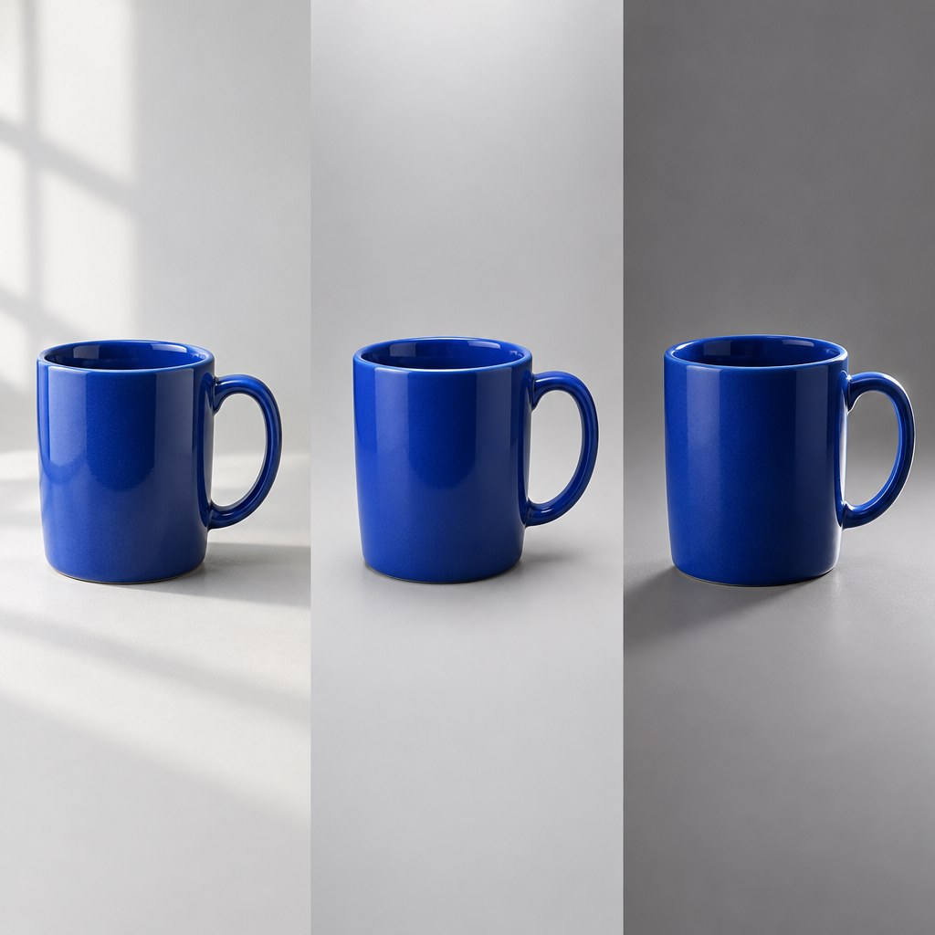
For example, if you sell a blue ceramic mug with a curved handle, the blue glaze and handle style belong in the factual column. A pale cream studio background and morning-window lighting belong in the creative column. If you do not have reliable photographs or specifications, label the result as a concept illustration; do not claim it depicts the precise SKU. When a reference photograph is available, upload it only if you have the rights and the chosen tool supports reference-image workflows.
A useful preflight question is: Which elements would make a customer complain that the product looks different from the listing? Those are accuracy gates, not optional style preferences. Record them before you create the first image.
Step 2: describe the frame before describing the mood
“Professional” and “premium” mean different things to different people. Concrete framing terms are more useful: front three-quarter view, eye-level camera, full product visible, centered object, balanced margins, neutral background, and one soft shadow. For an ecommerce thumbnail, a straightforward angle often communicates the item more clearly than a dramatic, partially obscured crop. For a homepage hero, negative space may matter more because a heading or button will sit beside the product.
Write the destination into the prompt. A square marketplace preview, a vertical social story, and a wide website banner need different framing. You can request an aspect ratio, but also explain the intended crop and safe space; a model may not honor every layout instruction perfectly. Inspect the actual output dimensions and framing before adding it to a live design. Do not rely on the generated image to contain reliable small-print packaging text or legal copy.
Step 3: control lighting and material appearance
Lighting words become useful when they describe what should be visible. “Soft diffused light from camera left, a gentle natural shadow to the right, and restrained reflections” is more actionable than “cinematic luxury light.” For glass, request clean edges and realistic transparency; for brushed metal, request subtle directional highlights; for matte ceramics, request restrained specular reflections. State what not to do when it matters: no blown-out highlights, no plastic-looking surfaces, and no glare obscuring the product.
Keep the background simple while you establish accuracy. Once you have a reliable studio composition, test a contextual lifestyle setting such as a kitchen counter or work desk. The product should remain the hero, not disappear under props. If an object must be photographed to establish exact color, texture, compliance, or dimensions, a real photo remains the stronger source of evidence.
Step 4: use copy-ready prompt examples
Example A: ceramic coffee mug, neutral catalog scene
Create a realistic studio product-photo concept of a single navy-blue ceramic coffee mug with a rounded handle. Three-quarter angle, the entire mug visible, on a warm off-white seamless background. Soft diffused daylight from the upper left, realistic ceramic sheen, gentle contact shadow, clean edges, and no props. Keep ample space around the mug for a square ecommerce crop. Do not invent a logo, printed slogan, lid, or saucer. This is a concept visual rather than proof of an actual listed item.
This example controls shape, count, angle, lighting, and absent accessories. If a real mug is being sold, replace generic color and shape assumptions with its verified specifications or authorized reference image.
Example B: handmade soap for a lifestyle header
Create an editorial lifestyle concept featuring a rectangular handmade soap bar on a dry stone tray beside a folded natural-cotton towel. Warm morning window light, restrained earthy palette, believable shadows, no hands or people. Position the soap in the right third with uncluttered space on the left for a website heading. No text or branding in the image; realistic texture, no glitter or exaggerated foam.
For a hero image, explicit negative space is more important than loading the prompt with luxury adjectives. Keep any brand name and legally required text in the webpage’s accessible HTML, not baked into the image.
Example C: reusable water bottle with reflective material
Generate a clean product-photo concept of a single brushed stainless-steel reusable water bottle, upright on a neutral charcoal surface, front three-quarter perspective. Use two broad soft reflections to show the cylindrical form without harsh streaks. The bottle is fully in frame and centered. Background softly graded, no condensation, no mountains, no sports equipment, no extra caps or labels. Preserve realistic metal texture and a tidy silhouette.
This tests surface rendering. Before publication, check that the lid and base are plausible and that no fabricated manufacturer’s badge appears.
Example D: leather notebook for an overhead listing
Create a top-down flat-lay concept of one closed dark-brown leather notebook on a light wooden desk. An unbranded pencil sits diagonally at the edge as a secondary prop. Bright but soft daylight, gentle shadows, natural leather grain, neat composition and generous margins. No letters, no fake embossing, no open pages, and no extra stationery. Make the notebook clearly identifiable as the main subject.
Flat lays can become cluttered quickly. If the pencil competes with the product, remove it rather than adding further descriptive adjectives.
Example E: skincare bottle for a mobile story
Produce a vertical 9:16 concept image of one plain amber glass skincare bottle with a simple pump dispenser against a soft sand-colored background. Gentle studio light, realistic transparent glass, controlled reflections, no human face, no water splash. Keep the entire pump visible and leave the top quarter uncluttered for an overlay added later. Do not create ingredient claims, certification symbols, a product name, or tiny packaging copy.
Skincare images require extra caution: never infer ingredients, medical effects, certifications, or before-and-after results from a generated graphic.
Step 5: improve an image with targeted revisions
After the first output, write a short acceptance note: What worked? What must change? What must stay exactly the same? Then ask for one or two concrete changes, not a full rewrite. Example: “Keep the mug, viewing angle, colors, and background unchanged. Make the shadow softer and move the object slightly right to create headline space on the left.” This makes the result easier to compare and reduces the chance of accidentally losing an element you already liked.
Run a small test grid if you have time. Hold subject, background, and crop constant while trying three lighting instructions. Select the clearest result, then hold that lighting constant and test the camera view. Treat each output as an experiment with named variables and a recorded choice. The approach is useful even when the tool does not support random seeds or repeatable generation.
When editing a real product photograph, explicitly say whether the object itself may change. For a legitimate catalog image, background cleanup may be acceptable while shape, logo, print, colors, and included accessories must remain faithful. Compare the revision against the original photo at full size, not only at thumbnail scale.
Step 6: check realism, accessibility, and buyer trust
A successful image should pass more than an aesthetics test. Zoom in to the handle, seams, lid, reflections, fingers if present, text, and any repeated pattern. AI tools can produce visually plausible objects with physically inconsistent details. Review color and shape against authentic product records. If the mockup shows packaging, make sure it does not suggest an unverified guarantee, safety seal, award, or certification.
- Product accuracy: no fabricated features, accessories, logos, specifications, or claims.
- Composition: subject visible at intended mobile and desktop crops; adequate space for any page text.
- Technical fit: sufficient dimensions, manageable file size, and a format supported by the website.
- Accessibility: informative alt text describing what the image actually shows, without keyword stuffing.
- Disclosure: use clear language such as “AI-generated concept image” where viewers might otherwise mistake a concept for a verified product photo.
- Rights: check the tool’s current terms, any reference-image permissions, and any applicable marketplace or advertising policies.
For web publishing, use a descriptive filename, reserve visible dimensions to avoid layout shift, and compress the asset appropriately. Alt text might read “Concept image of an amber pump bottle against a beige studio background,” not a promotional keyword chain. Decorative images may warrant empty alt text; informative images do not.
Step 7: adapt the same brief for ChatGPT Images and Gemini
Both ChatGPT Images and Gemini support natural-language image instructions, but their interfaces and capabilities can change. The practical technique is portable: describe the scene, make crucial constraints explicit, and review results before using them. Google’s official Gemini guidance recommends describing the desired style, subject, action, and setting. OpenAI’s guidance likewise emphasizes clear requests and iterative refinement. These are useful starting points, not promises that a tool will satisfy every constraint.
If your chosen version supports uploading or editing an existing image, use an authorized product photograph as a reference and specify which visual properties must remain unchanged. If you are generating a fresh concept, ask for a neutral first composition before testing a complex scene. Do not assume generated text is accurate; add prices, ingredients, measurements, and calls to action through the page editor after verifying them independently.
Read the current product documentation before promising a buyer any particular export resolution, commercial license, or feature. For reference, see OpenAI’s guide to ChatGPT Images and Google’s image-generation help for Gemini.
A simple prompt-testing worksheet
Use a small worksheet for each asset. Record the product or concept, intended channel, approved facts, output crop, visual references, first prompt, generated version, errors found, and next revision. Give the result a simple pass, revise, or reject decision. The point is not bureaucracy: it lets you reproduce a successful visual direction and stops a later edit from quietly changing something important.
For example, suppose the first mug image looks convincing but adds a non-existent coaster. Mark accuracy as fail, keep the original camera and light settings, and request removal of the coaster. If the second version corrects the accessory but distorts the handle, reject it and request a more constrained edit. Do not approve merely because the latest image is attractive. Tie approval to the facts and intended placement written before generation.
When working at scale, create one style guide per campaign: lighting direction, background family, crop rules, typography policy, disclosure policy, and final checklist. You can then reuse a core prompt template while swapping only verified product inputs. This reduces repetitive writing without pretending one generic prompt fits every kind of merchandise.
Further reading: For another visual creation walkthrough, read our guide to creating AI images. If you are preparing printable activities rather than physical merchandise, see how to make a print-ready kids puzzle page. Different outputs require different QA checks.
Common mistakes and how to repair them
Too many conflicting instructions
A brief that requests a bright daylight studio, dark dramatic cinematic lighting, a white backdrop, and a busy outdoor market in one frame may produce unpredictable compromises. Decide which setting serves the customer first; move alternative creative directions into separate test prompts.
Asking AI to invent product specifications
Never let a generator fill missing data with confident guesses. If the bottle capacity, packaging claims, or ingredients are unknown, leave them out. Source facts from the seller’s verified records or the actual item. A photo concept can be useful without asserting specifications.
Embedding marketing copy in the generated artwork
Small text, prices, and brand typography are easy to misrender and hard to maintain. Request a text-free scene, then add approved copy as editable website text. This supports responsive layouts and makes updates easier.
Using a repeated generic prompt for every product
A fabric bag needs attention to stitching and drape; a glass bottle needs transparency; a phone case needs precise cutouts. Start with the product’s failure risks, then select the camera and material instructions that address those risks.
Publishing the first result without review
At least one human or automated review should assess accuracy, crop, legal claims, accessibility, and rights. If crucial evidence is absent, the correct recovery is to obtain evidence or use a clearly labeled concept—not to switch off the quality gate.
Frequently asked questions
How long should an AI image prompt be?
Long enough to define what matters; short enough to avoid contradictory filler. A concise brief with subject, composition, lighting, setting, and constraints often beats a paragraph of vague mood words. Add detail only to solve a specific observed problem.
Should I use negative prompts?
Ordinary language such as “no extra labels or accessories” can clarify constraints. Some tools offer dedicated negative-prompt controls and others do not. Do not assume a constraint will always be obeyed; inspect the generated output instead.
Can I use the same prompt for every marketplace?
Reuse the factual product description and style rules, then adapt crop, backdrop, asset dimensions, disclosure, and placement to each platform’s current rules. A social campaign illustration and a primary product listing photo may have different requirements.
How can I maintain visual consistency across products?
Save a style brief, reference images when authorized, framing rules, and a short record of successful instructions. Compare a contact sheet at similar thumbnail sizes. Consistency does not require every item to have the same material reflections or accessories.
Are generated product photos always suitable for selling?
No. They can be useful for concepts, mockups, and some promotional designs, but images that invent properties of a real item can mislead buyers. Check the applicable marketplace policy and the seller’s factual evidence. Use accurate real photos wherever product fidelity is essential.
Final checklist before you publish
Confirm the output has one clear product or intended scene; matches the verified attributes; contains no fabricated claims; fits the required crop; has readable contrast where HTML text will overlay it; uses appropriate alt text and compression; and is identified as conceptual if that distinction matters. If an item fails, revise only that element and recheck. If factual evidence is missing, gather it rather than overriding the warning.
These practices apply whether you write a prompt yourself or use a prompt-writing assistant. For additional context on evaluating one commercial prompt-related offer, see our SVision AI review. The review distinguishes confirmed information from details that still require checking; this independent how-to guide does not endorse unverified product capabilities.
Bottom line: a repeatable image workflow combines a specific brief, truthful product information, small iterative edits, and a final review. Better prompts improve direction; trustworthy publishing still requires verification.